KELP FIELD NOTES / ORIGIN STORY
Before Kelp
Had a Name
A spring 2019 trip to Sea Ranch became an early visual origin point for Kelp: wild coast, optimistic design, Black Mountain-style experimentation, Barbara Stauffacher Solomon supergraphics, and the idea that a catalogue can be a way of living.
Spring 2019.
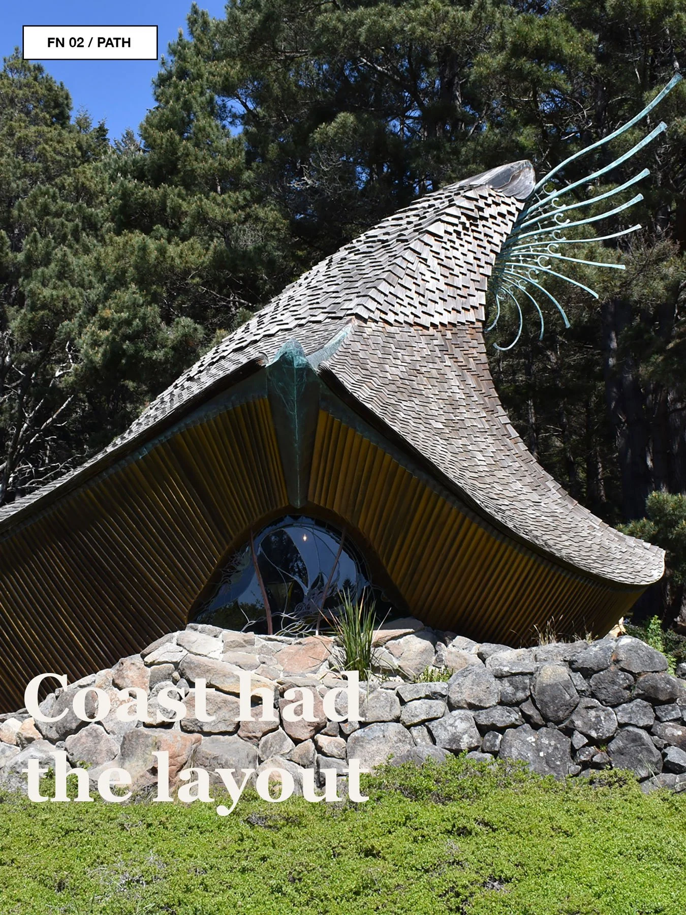
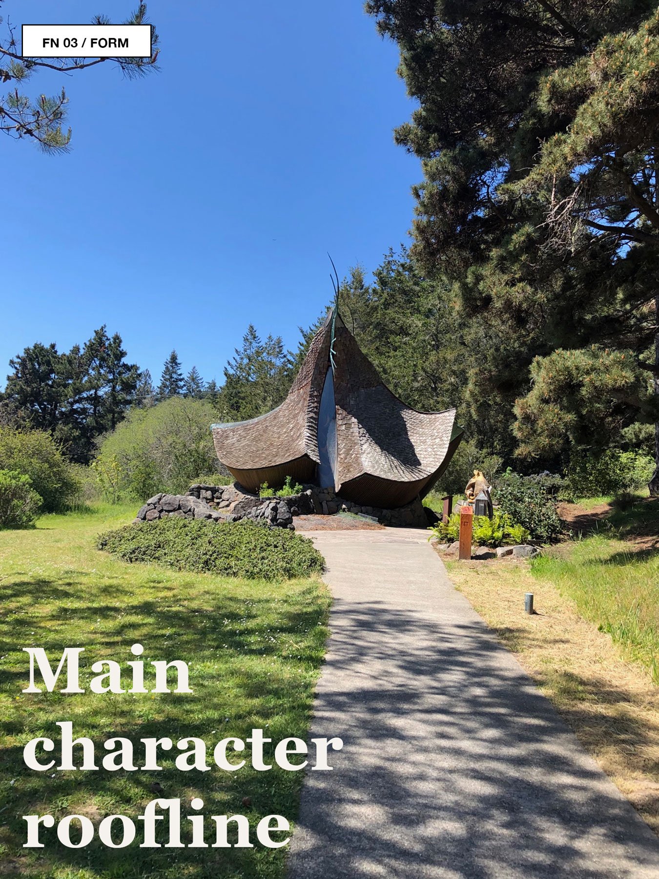
This idea has been brewing for a while. Probably somewhere between a bluff walk, a suspiciously perfect pool, a tiny chapel with a roofline doing the most, and a red supergraphic heart that looked like it had escaped from a very stylish school gym.
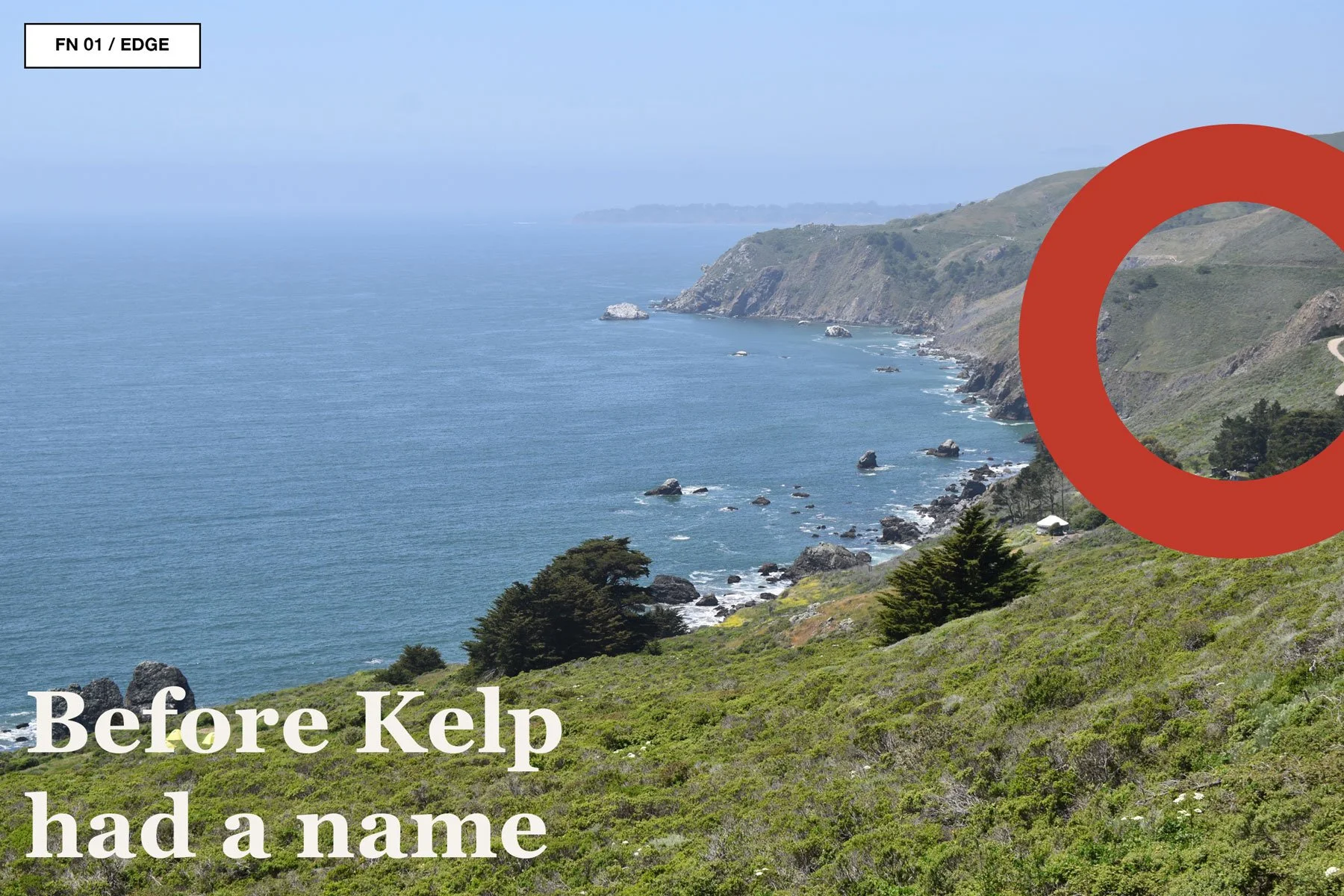
Before Kelp had a product list, before the Field Guide format started to take shape, before the cold-water surf prints and camp goods began behaving like they might become a real shop, there was a spring trip to Sea Ranch in 2019.
At the time, it did not announce itself as an origin story. It was just a stretch of coast, a few long walks, some weathered timber, and the creeping sense that design might be more fun if it stopped trying so hard to be tasteful.
Sea Ranch has that effect.
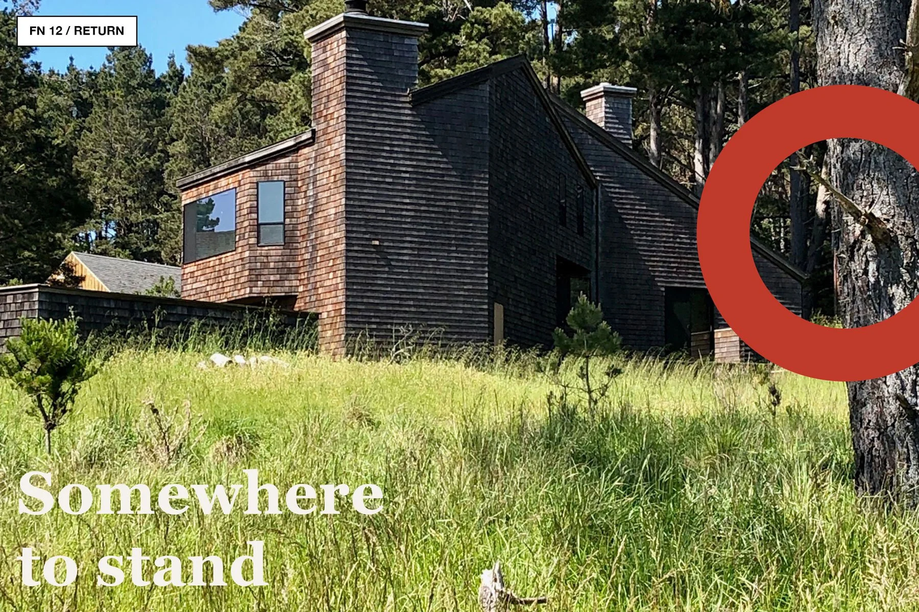
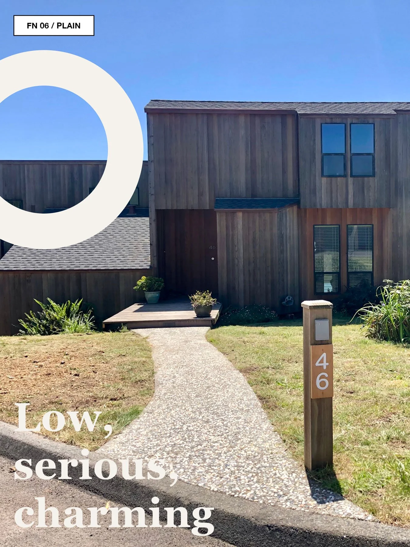
It makes the built world feel temporary beside the land. The houses sit low against the wind. The hedgerows stand around looking severe and useful. The meadows run to the bluff. The ocean takes up half the conversation. Everything seems edited by exposure: salt, fog, timber, grass, time, and the occasional graphic intervention saying, “Actually, what this room needs is a giant red heart.”
For Kelp, that trip became a seed. Not a business plan. More like a visual burr stuck to a sock.
A coast can be a catalogue. A path can be a logo. A field note can become a store.
The Utopian Bit
Sea Ranch was conceived in 1964 by developer Al Boeke with a group of Bay Area architects, landscape architects, and graphic designers, including Lawrence Halprin, Joseph Esherick, MLTW, and Barbara Stauffacher Solomon (Modern Diplomacy). The original proposition was wildly earnest in the best possible way: a modern coastal community that would live lightly on the land, protect shared open space, and resist the visual clutter of conventional suburban development (Modern Diplomacy).
It was not just “nice houses near the ocean.”
It was an experiment in how to behave.
Could buildings stay low and let the land be the main event? Could a community share meadows instead of carving everything into private trophies? Could timber, rooflines, fences, paths, and planting become a kind of coastal etiquette?
That idealism still clings to the place. Not perfectly. Not innocently. But visibly.
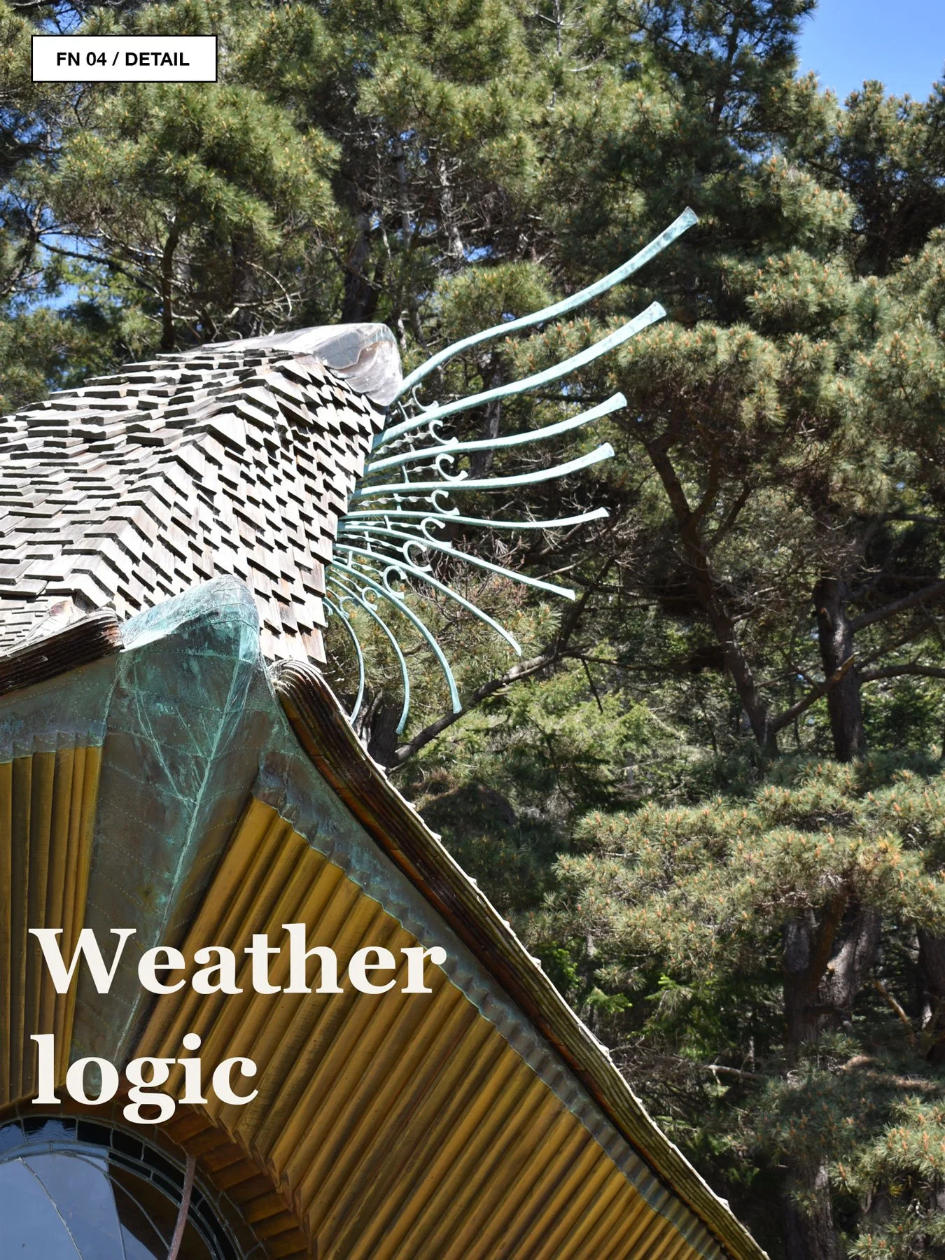
You can read it in the disciplined rooflines, the weathered siding, the clustered buildings, the almost funny seriousness of the hedgerows, and the feeling that the whole place was designed from the scale of weather outward. The architecture does not try to win against the coast. It tries to be invited back.
Black Mountain, But Make It Coastal
The other ghost in the room is Black Mountain College.
Black Mountain College was founded in North Carolina in 1933 and became a famously experimental, interdisciplinary arts community where art, craft, design, performance, and daily life were allowed to cross-pollinate in unruly ways (Black Mountain College Museum + Arts Center). After the Bauhaus closed in 1933, Josef and Anni Albers came to Black Mountain and became core members of the community, carrying forward workshop-based ideas about art, craft, technology, experimentation, and well-designed everyday life (Black Mountain College Museum + Arts Center).
This matters because Kelp is not just borrowing a look. It is borrowing a method.
Learn by making the thing. Let art and life sit at the same picnic table. Take craft seriously, but not solemnly. Treat the catalogue, the shop, the field note, the photo, the print, and the joke as related species. Let experiments look a little experimental.
Sea Ranch and Black Mountain are not the same project, but they share a useful optimism: the belief that design can be a way to reorganize daily life. Not in a glossy manifesto way. More like: what if the path matters? What if the mug matters? What if the wall graphic matters? What if a shop could behave like a tiny school for looking?
The Wild Coast as Grid
The Northern California coast is not soft.
At Sea Ranch, the ocean feels architectural. It cuts a line. The wind edits posture. Cypress forms become shelter diagrams. Meadows operate like negative space. The land is not background. It is the dominant system, and it has very little interest in your content calendar.
This is where Kelp’s visual instincts started to make sense: fog green, raw cream, nautical blue, black linework, field-guide captions, small-format diagrams, and the satisfying bossiness of a good rule line.
The horizon was the grid. The bluff path was the index. The fences were punctuation. The houses were footnotes.
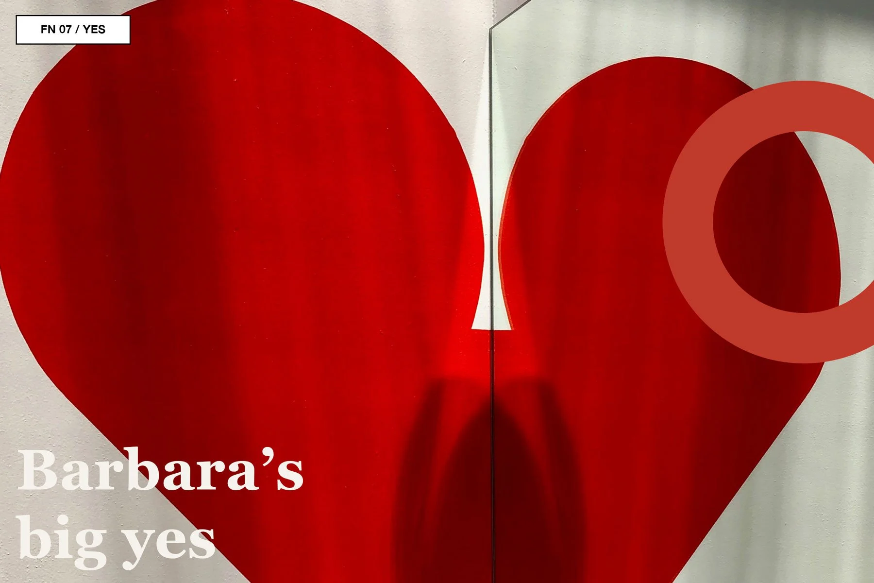
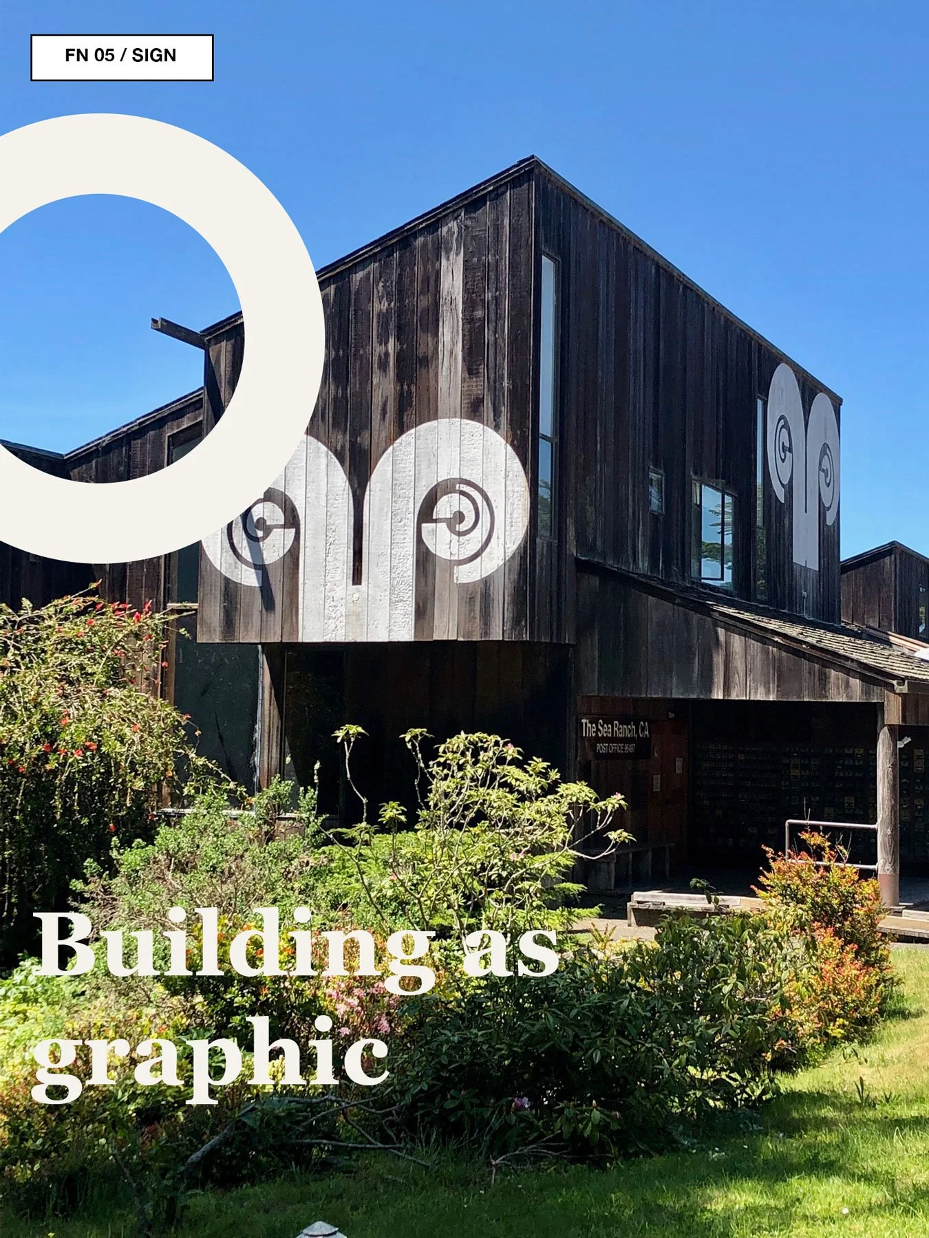
Barbara’s Big Yes
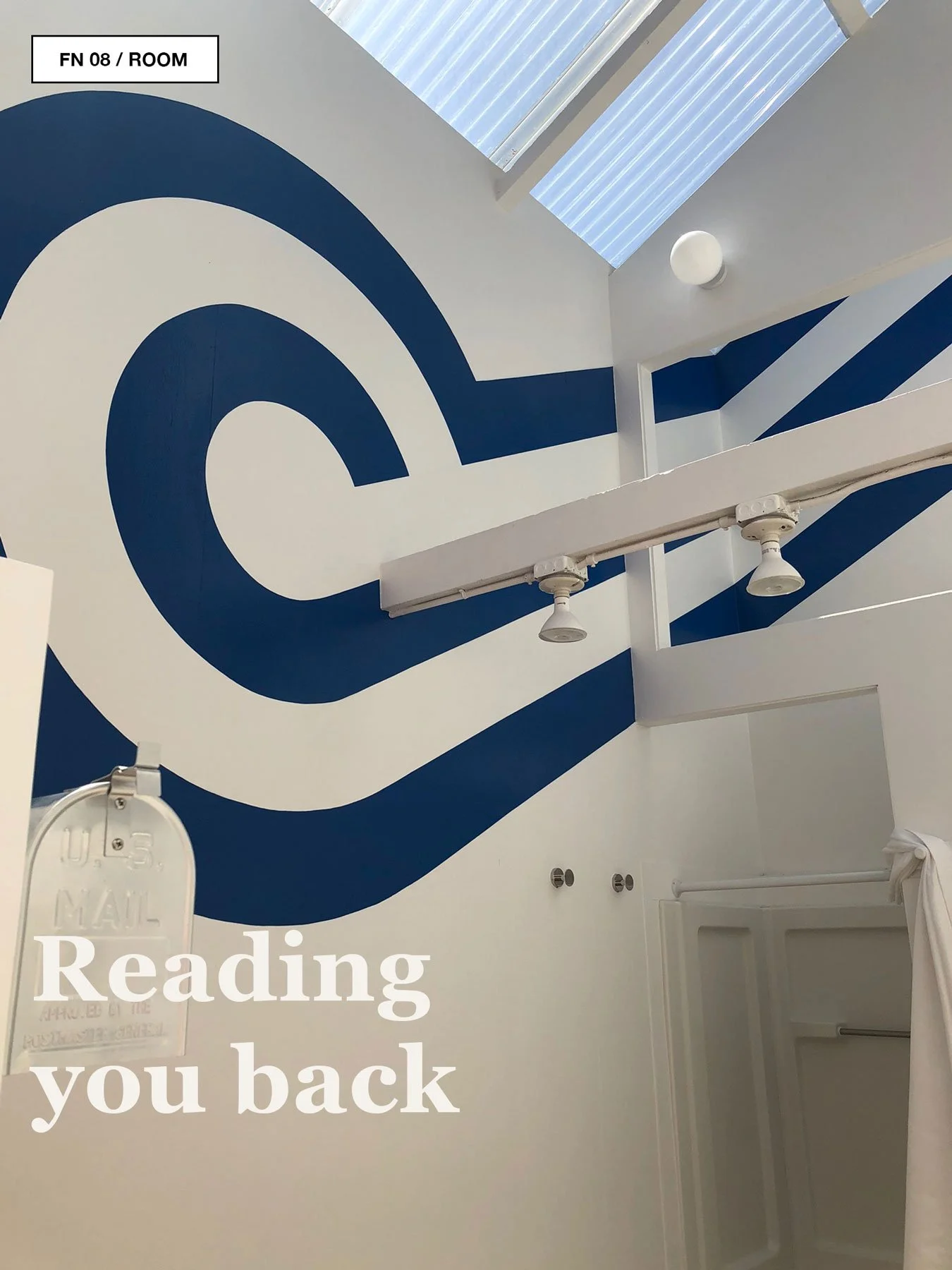
Barbara Stauffacher Solomon first developed her signature Sea Ranch supergraphics in the 1960s, bringing Swiss-trained graphic discipline, Helvetica, and a willingness to break the rules into the project’s communal interiors (SFMOMA). Her work turned walls into signs, rooms into printed pages, and architecture into something you could read with your whole body.
This is the part of the origin story where Kelp gets permission to stop being too polite.
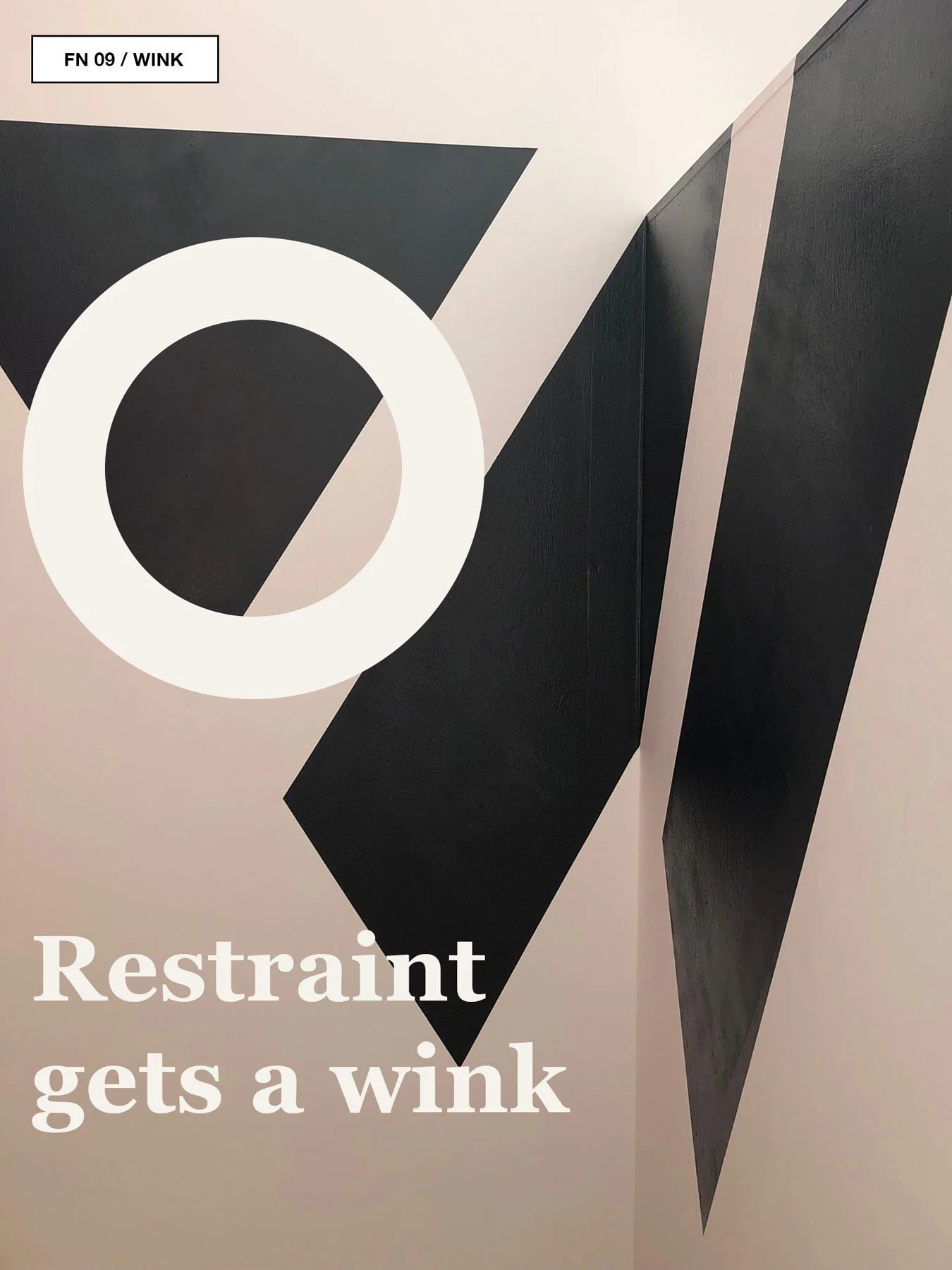
The coast does not have to be rendered only in driftwood neutrals and tasteful restraint. It can hold stripes. Arrows. Circles. Diagonals. Vermillion. Nautical blue. Kelp green. A red heart so bold it looks like it knows the Wi-Fi password.
Sea Ranch taught us that a coastal brand does not need to whisper all the time. Sometimes it needs to paint a giant circle on the wall and mean it.
Access to Tools
The Whole Earth Catalog sits nearby in the same constellation, wearing sensible shoes and carrying a lot of information.
Created by Stewart Brand in the late 1960s, the Catalog began in 1968 as a pickup truck hauling catalogs and wares around communes and communities, and it became a defining object of DIY and do-it-together culture (Cornell University Library). Its editorial focus was self-sufficiency, ecology, alternative education, DIY, community, and holism, organized around the famous idea of “access to tools” (Whole Earth Index).
For Kelp, the Whole Earth reference is not about imitation. It is about orientation. A catalogue can be more than a place to buy things. It can be a way to gather tools, images, instructions, jokes, fragments, weather reports, and field observations into a portable worldview.
That is part of why the Kelp logo and type direction keeps circling back to Whole Earth energy: warm, odd, practical, slightly countercultural, and not too polished. The Windsor reference matters because it carries that soft radicalism: less corporate modernist, more handmade future. The Whole Earth Catalog’s cover use of Windsor is one of the typeface’s best-known cultural appearances (GQ).
Access to tools, but make it cold water.
What Started There
The spring 2019 Sea Ranch trip gave Kelp a set of permissions.
It allowed the brand to be coastal without being generic. It allowed the visual system to mix landscape sensitivity with graphic confidence. It connected surf culture to architecture, architecture to ecology, ecology to print culture, and print culture to the small, practical romance of a catalogue.
It also clarified something simple: Kelp was never just about selling coastal images.
It was about making a field guide for a certain kind of life.
The life is not polished. It is fogged-in, wind-tangled, ferry-scheduled, beach-walked, tide-aware, camp-curious, and occasionally ridiculous. It has room for good typography and wet boots. It likes a diagram. It believes a shirt can be a souvenir from a place you have not reached yet. It thinks a shop can feel like a notebook.